I recently had the opportunity to photograph one of my customer's beautiful model homes. The interior decor was very neutral, yet I put a fair amount of work into making the photographs look that way.
Here is a case where your brain sees neutral colors but the camera chooses one color balance and the neutral colors shift based on the light source. Objects closer to the windows are bluer and those further away are influenced by the incandescent lights and are recorded as more orange. The same happens when compact florescent lights are in use, but there is extreme yellow saturation near the lights.
Below is a photograph of the kitchen as photographed with tungsten gels modifying the daylight output of the flash units. In these conditions, 1/2 or 1/3 of the flash unit is covered with an orange tungsten correction gel. I have spent many years looking and identifying these colors, so don't be surprised if you don't see much difference. My high quality photography is the sum of a dozen or more factors (timing, composition, camera, lighting, etc.), and this is just one. I have provided a second image that super saturates everything so you can better see the areas that are too blue.
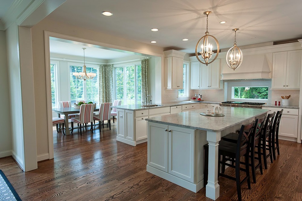 |
| Kitchen as captured in one exposure |
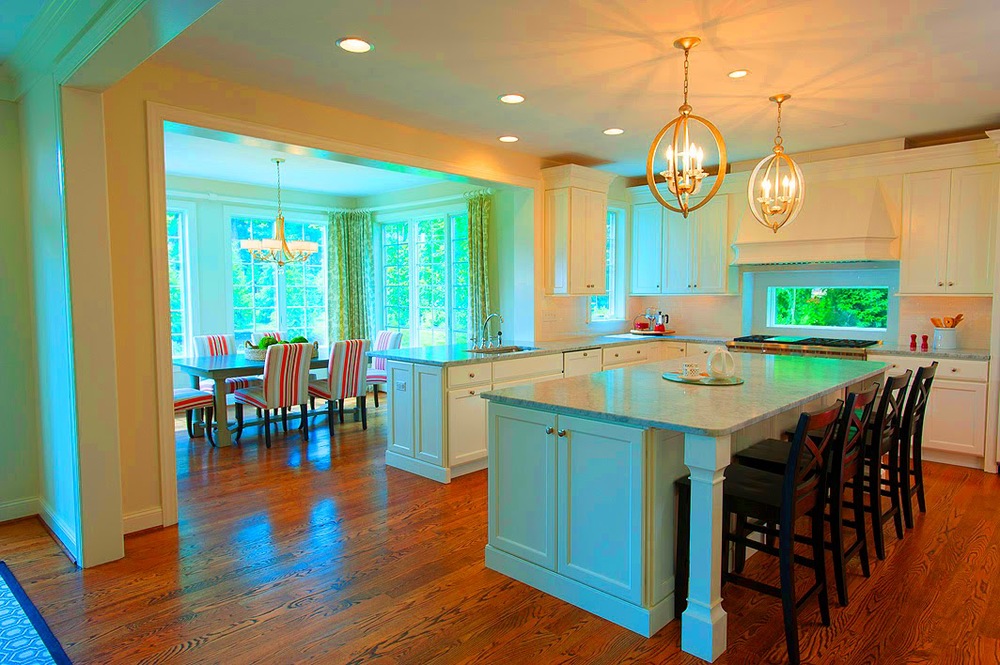 |
| Same image super saturated to illustrate blue areas |
The first step is to make an image that is color corrected to the bluer areas and blend it into the photograph using Photoshop layers, a layer mask and brushes. This next photo is chosen for its neutral daylight areas. It is made at a shorter exposure so that some highlight details can be brought in as well.
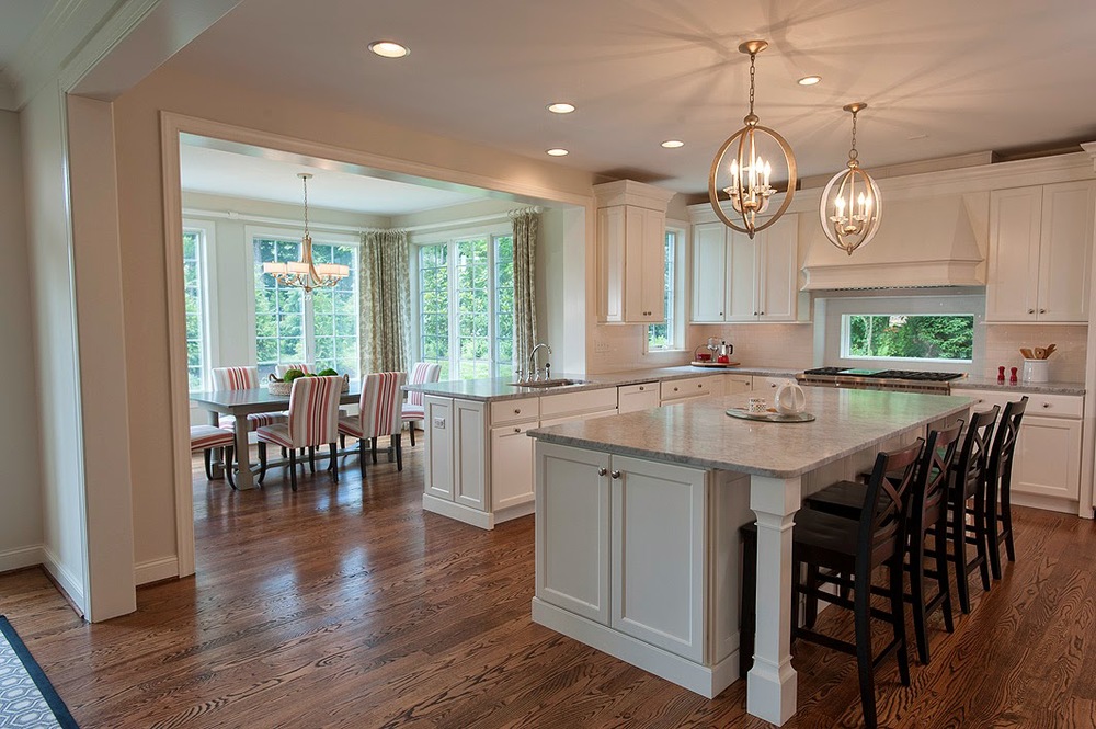 |
| Image adjusted for daylight balance |
When these two are combined, some other details are attended to, and perspective control is applied, this is the final result. It appears as neutral as you would see it when you toured the model home.
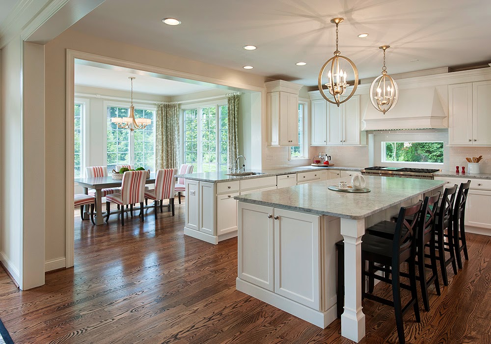 |
| Final kitchen image |